Whenever a year comes to an end, the Internet is filled with lists of everything we’ve seen in the last twelve months or predictions of what we’ll see in the future. There are also trends in software development and digital design that are worth noting in a list. Development in the cloud, app programming interfaces (APIs), special use of fonts, the growth of storytelling, responsive design and the use of parallax and a tendency towards simplicity are the top trends for 2016.
Here we outline some of the most important for both digital project developers and web page and app designers.
Design trends for 2016
● Responsive design.
Responsive design, which establishes a single design for all devices (desktop, mobile and tablet), became widespread in the digital sector in 2015. 2016 may be the year in which it becomes the definitive standard.
A number of teams have embraced this multi-device design –essentially for two reasons: because content is being consumed on devices like smartphones and tablets, and because it cuts development times.
Responsive design has some advantages for digital teams:
– A different user experience: User experience is now at the core of every project, largely because the user –the audience– is key. Responsive design creates a single experience whatever the environment. UX are the important new metrics: the length of time on a page or the number of pages served per user, for example.
– It increase the volume of conversions: Improving the user experience on all devices with standard styles offers security, encourages intuitive consumption and boosts income.
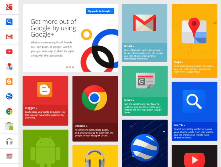
● Material Design Lite.
One of the new developments presented at the Google developers conference in 2014 (Google I/O 2014) was this Material Design Lite, a new trend designed for the Android operating system, but also for all other environments. MDL is a series of front-end components used by designers to assemble simple interfaces for mobile devices. Naturally it is based on HTML, CSS and JavaScript and can be used with any development framework.
MDL goes hand-in-hand with the trend known as Paper Elements, a set of visual elements for the development of UX for Google devices. It includes everything from buttons and different types of menus, to card-type design. MDL makes it possible to treat design almost like a game of Tetris, even incorporating new elements into old designs without touching the project code.
● More infinite scroll, more parallax. .
Some users find the One Page-type web pages rather strange, as the sites have practically no menu and it drops down vertically in an almost infinite scroll. 2015 was the year of the One Page websites and this trend is very likely to develop even farther in 2016. The idea is to make more use of scrolling, where the user reveals the content by moving downwards, with fewer browser clicks per menu.
A key technique within this type of pages is parallax. This allows the use of image and animation that appear and disappear in the foreground and middle ground and give the user the sensation of looking at a website with two speeds and a large depth of field. The use of parallax and the infinite scroll design technique has pros and cons:
Advantages:
– The time required to conceptualize and design the site architecture is reduced to a minimum: It has no long browser menus, as this is a web page with a single screen.
– These pages are geared to brand marketing: As there is only one landing page, this significantly favors the capacity for conversion.
– Less time spent on development and on layout.
Disadvantages:
– Less organic traffic for positioning in search engines: One of the key elements in positioning in search engines is the volume of information and URLs. There is only one URL.
– It takes a considerable job of content editing and visual efficiency to concentrate everything essential in one URL.
This type of design is undergoing an enormous boom due to its features and the advantages of storytelling for brand projects. Stories that trigger reactions in the user were the stars of 2015 and will continue to be in 2016. The audience is at the center of everything, and that orientation is only possible thanks to the content. More storytelling.
● Card-based design.
Web pages from all over the world opted in 2015 for card-type design. This type of design provides order, contextualization, simplicity and efficiency and is a very straightforward solution in terms of design and development, without being in any way sub-standard or lacking in resources. Quite the contrary. For a digital project focused on creating contents –whether as a means of communication or a web page for marketing contents–, card-type design is a very interesting option. Companies as experienced as Google or social networks like Twitter and Facebook use this type of technique.
● Flat design.
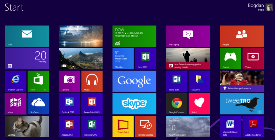
Minimalism. Without volume, without shadows, without shading or blurring… Flat design is exactly what its name implies. Flat design. And therein lies its potential. The goal is extreme simplicity. The aim is to supply a lot of information with the fewest possible graphic and communications resources.
This design can be applied supplied both on web pages and mobile apps. A paradigmatic example of flat design is the user interface in Microsoft Windows 8 and 10, which they call Modern UI or modern user interface. The firm from Redmond is one of the companies that has been applying flat design for some time. And they’re not the only ones –Apple and Google do too.
● Creative use of fonts.
Every day more and more designers are using fonts as an end and not just as a means. Fonts as a content itself, as a communicative element. Large fonts are becoming ever more widespread, combining their enormous power with images, illustrations and animations and taking the role of another graphic element, which is both aesthetic and capable of conveying emotions.
Tools like Google Fonts allow designers to choose the fonts for their digital projects, for titles, highlighting, headers, menus, text paragraphs and more. Google Fonts is an easy way to try out all kinds of different sizes and types of fonts. A trend in design for 2016 will be the creative combination of typefaces.
● Animated image: GIFs, cinemagraphs and loading animations.
In the image category –in addition to the use of large-scale resources covering the whole width of the site–, 2016 also heralds the arrival of the animated image: from the famous GIF through to the less well-known cinemagraph, a static image to which some movement is added in a loop.
This type of animated images can be used in headers to endow web pages with movement and depth.
Loading animations will also be a trend in 2016. There are already a number of web pages that use them to entertain the user while the site is loading or is performing a specific action which requires a waiting time. Some services use images on a loop while the user uploads files to the cloud, for example. These animations tend to be common in One Page-type pages.
● Microinteractions.
The aim of any website is to trigger actions in the user. Micro-interactions foster consumption and will continue to be a trend in 2016. Encouraging users by means of buttons or windows designed to prompt them to sign up for a newsletter or a discussion forum, fill in a form or rate a particular content will be one of the evident challenges for designers this coming year.
Open finance is expected to be regulated over the next few years, leading to a new open data ecosystem Open finance is making its way into the legal system through the consolidation of several initiatives that will lend it legal protection. Once this is complete, customers will have an open finance framework that protects their data […]
APIs are the future of automated banking services. Albert Pla, Head of SME eSales in BBVA Global Markets, tells us about this technology. APIs are one of the newest and most highly anticipated tools in Open Banking. They can automate business processes and allow bank transactions to be carried out without leaving the company’s work […]
Real-time payments have become one of the most noteworthy innovations in the financial industry. Their growth in recent years has been significant thanks to the possibilities they offer companies, especially in customer relations.
Please, if you can't find it, check your spam folder
×
The email message with your ebook is on the way
We have sent you two messages. One with the requested ebook and one to confirm your email address and start receiving the newsletter and/or other commercial communications from BBVA API_Market
×
PROCESSING OF PERSONAL DATA
Who is the Data Controller of your personal data?
Banco Bilbao Vizcaya Argentaria, S.A. (“BBVA“) with registered address at Plaza de San Nicolás 4, 48005, Bilbao, España and Tax ID number A-48265169 . Email address: contact.bbvaapimarket@bbva.com
What for and why does BBVA use your personal data for?
For those activities among the following for which you give your consent by checking the corresponding box:
to receive newsletter from BBVA API_Market through electronic means;
to send you commercial communications, events and surveys relating to BBVA API_Market to the e-mail address you have provided.
For how long we will keep your data?
We will keep your data until you unsubscribe from receiving our newsletter or, if applicable, the commercial communications, events and surveys to which you have subscribed. Whether you unsubscribe or whether BBVA decides to end the service, your details will be deleted.
How can I unsubscribe to stop receiving newsletters and/or communications from BBVA API_Market?
You can unsubscribe at any time and without need to indicate any justification, by sending an email to the following address: contact.bbvaapimarket@bbva.com
To whom will we communicate your data?
We will not transfer your personal data to third parties, unless it is mandatory by a law or if you have previously agreed to do so.
What are your rights when you provide us with your information?
You will be able to consult your personal data included in BBVA files (access right)
You can modify your personal data when they are inaccurate (correction right)
You may request that your personal data not be processed (opposition right)
You may request your personal data be deleted (suppression right)
You can request a limitation on the processing of your data in the allowed cases (right of limitation of processing)
You will be able to receive, in electronic format, the personal data you have provided to us, as well as to transmit them to another entity (portability right)
You are responsible for the accuracy of the personal data you provide to BBVA and to keep them duly updated. If you believe that we have not processed your personal data in accordance with regulations, you can contact the Data Protection Officer of BBVA at the following address dpogrupobbva@bbva.com.
You can find more information in the “Personal Data Protection Policy” document on this website.
×
PROCESSING OF PERSONAL DATA
Who is the Data Controller of your personal data? Banco Bilbao Vizcaya Argentaria, S.A (“BBVA“), with registered address at Plaza de San Nicolás 4, 48005, Bilbao, España, and Tax ID No. A-48265169. Email address:contact.bbvaapimarket@bbva.com
What for and why does BBVA use your personal data for?
For the execution and management of your request, specifically, download the requested e-book/s.
BBVA informs you that, unless you indicate your opposition by sending an email to the following address: contact.bbvaapimarket@bbva.com, BBVA may send you commercial communications, surveys and events related to products and/or services of BBVA API Market through electronic means.
For how long we will keep your data?
We will keep your data as long as necessary for the management of your request, and to receive commercial communications, events and surveys. BBVA will keep your data until you unsubscribe to stop receiving our newsletters or, where appropriate, until the end of the service. Afterwards, we will destroy your data.
How can I unsubscribe to stop receiving newsletters and/or communications from BBVA API Market?
You can unsubscribe at any time and without need to indicate any justification, by sending an email to the following address: contact.bbvaapimarket@bbva.com
To whom will we communicate your data?
We will not transfer your personal data to third parties, unless it is mandatory by a law or if you have previously agreed to do so.
What are your rights when you provide us with your information?
You will be able to consult your personal data included in BBVA files (access right)
You can modify your personal data when they are inaccurate (correction right)
You may request that your personal data not be processed (opposition right)
You may request your personal data be deleted (suppression right)
You can request a limitation on the processing of your data in the allowed cases (right of limitation of processing)
You will be able to receive, in electronic format, the personal data you have provided to us, as well as to transmit them to another entity (portability right)
You can exercise before BBVA the aforementioned rights through the following address: contact.bbvaapimarket@bbva.com
You are responsible for the accuracy of the personal data you provide to BBVA and to keep them duly updated.
If you believe that we have not processed your personal data in accordance with the regulations, you can contact the Data Protection Officer at the following address: dpogrupobbva@bbva.com
You can find more information in the “Personal Data Protection Policy” document on this website.
Banco Bilbao Vizcaya Argentaria, S.A. owner of this portal uses cookies and/or similar technologies of its own and third parties for the purposes of personalization, analytics, behavioral advertising or advertising related to your preferences based on a profile prepared from your browsing habits (e.g. pages visited). If you wish to obtain more detailed information, consult our Cookies Policy.
Cookie settings panel
These are the advanced settings for first-party and third-party cookies. Here you can change the parameters that will affect your browsing experience on this website.
Technical Cookies (required)
These cookies are used to give you secure access to areas with personal information and to identify you when you log in.
Name
Owner
Duration
Description
gobp.lang
BBVA
1 month
Language preference
aceptarCookies
BBVA
1 year
Configuration Accepted Cookies
_abck
BBVA
1 year
Helps protect against malicious website attacks
bm_sz
BBVA
4 hours
Helps protect against malicious website attacks
ADRUM_BTs
Salesforce Marketing Cloud
Session
Required for monitoring of the service, inherent to SFMC
ADRUM_BT1
Salesforce Marketing Cloud
Session
Required for monitoring of the service, inherent to SFMC
ADRUM_BTa
Salesforce Marketing Cloud
Session
Required for monitoring of the service, inherent to SFMC
ADRUM_BT
Salesforce Marketing Cloud
Session
Required for monitoring of the service, inherent to SFMC
xt_0d95e
Salesforce Marketing Cloud
Session
Remember user preferences (if any)
__s9744cdb192d044faa1bf201d29fafd1e
Salesforce Marketing Cloud
Session
Remember user preferences (if any)
wpml_browser_redirect_test
WPML
Session
Text translation in the portal
wp-wpml_current_language
WPML
24 hours
Text translation in the portal
They are used to track the activity or number of visits anonymously. Thanks to them we can constantly improve your browsing experience
Your browsing experience is constantly improving.
With your selection, we cannot offer you a continuously improved browsing experience.
Name
Owner
Duration
Description
AMCV_***
Adobe Analytics
Session
Unique Visitor IDs used in Cloud Marketing solutions
AMCVS_***
Adobe Analytics
2 years
Unique Visitor IDs used in Cloud Marketing solutions
demdex (safari)
Adobe Analytics
180 days
Create and store unique and persistent identifiers
sessionID
Adobe Analytics
Session
Launch's internal cookie used to identify the user
gpv_URL
Adobe Analytics
Session
Adobe Analytics plugin: getPreviousValue Capture the value of a certain variable in the following page view, in this case the prop1
gpv_level1
Adobe Analytics
Session
Cookie used to store the DataLayer levl1 of the previous page.
gpv_pageIntent
Adobe Analytics
Session
Cookie used to store the pageIntent of the previous page.
gpv_pageName
Adobe Analytics
Session
Cookie used to store the pagename of the previous page.
aocs
Adobe Analytics
Session
Cookie that stores the first values collected at the beginning of a process.
TTC
Adobe Analytics
Session
Cookie used to store the time between the App Page Visit event and the App Completed event.
TTCL
Adobe Analytics
Session
Cookie used to store the time between the LogIn event and App Completed.
s_cc
Adobe Analytics
Session
Determine if cookies are active
s_hc
Adobe Analytics
Session
Cookie used by Adobe for analytical purposes
s_ht
Adobe Analytics
Session
Cookie used by Adobe for analytical purposes
s_nr
Adobe Analytics
2 years
Determine the number of user visits
s_ppv
Adobe Analytics
Permanent
Adobe Analytics plugin: getPercentPageViewed Determine what percentage of the page a user views
s_sq
Adobe Analytics
Session
ClickMap/ActivityMap features
s_tp
Adobe Analytics
Session
Cookie used by Adobe for analytical purposes
s_visit
Adobe Analytics
2 years
Cookie used by Adobe to know when a session has been started.
They allow the advertising shown to you to be customized and relevant to you. Thanks to these cookies, you will not see ads that you are not interested in.
The advertising is customized to you and your preferences.
Your choice means you will not see customized ads, only generic ones.
Name
Owner
Duration
Description
OT2
VersaTag
90 days
VersaTag Cookie used to store a user id and the number of user visits.
u2
VersaTag
90 days
VersaTag Cookie where the user ID is stored
TargetingInfo 2
MediaMind
1 year
Cookie that serves to assign a unique random number that generates MediaMind.
These cookies are related to general features such as the browser you use.
Your experience and content have been customized.
With your selection, we cannot offer you a continuously improved browsing experience.
Name
Owner
Duration
Description
mbox
Adobe Target
9 days
Cookie used by Adobe Target to test user experience customization.
×
Looks like you’re browsing from Mexico, so let’s show you the custom content for your
location. Change
Looks like you’re browsing from Spain, so let’s show you the custom content for your
location. Change
Select a country
In order to access the private area and corresponding sandbox, select the country of the APIs you want to use.
