Robotics Institute at Carnegie Mellon University (CMU), Pittsburgh, USA. Two engineers are developing a tool that can analyze large demographic or educational datasets and how they are related to economics, such as the production sector or level of income. In October 2015 several publications reported on something that is already a reality: a web-based real-time, high-dimensional data explorer.
Saman Amirpour Amraii is a systems engineer. Amir Yahyavi is a researcher. Both have spent three years at CREATE Lab, the CMU innovation center, in the search for an efficient solution to visualize and analyze high-density data, i.e. data that contains so many parameters it is almost impossible to analyze. The result of their efforts is EVA (Explorable Visual Analytics), an open-source tool in JavaScript which is available in Github.
EVA is an online platform for “visualizing and analyzing large and high-dimensional data that allows users to intuitively browse through terabytes of data consisting of hundreds of dimensions”. Amraii, one of the founding-fathers of the tool, said: With this complex analytics solution, users can build simple geographical representations or complex 5-dimensional projections of the data, which they can share via a link or by downloading in PNG format.
<
EVA – Introduction from CREATE Lab on Vimeo.
The EVA development plan focused on six key aspects:
● EVA must be a scalable tool.
● A high-resolution solution.
● Intuitive browsing.
● Responsive.
● Fully accessible.
● A tool for drawing conclusions that can be shared.
Why EVA is a great analysis tool
Experts always talk about the three Vs of Big Data: Volume, Variety and Velocity. There is actually a fourth, which gives a sense to the whole and which would be essential in any data analysis process or solution. This fourth V is Value. There is no point in having large volumes of varied datasets and being able to process them at great velocity if we cannot draw valuable conclusions from the whole process.
EVA is a tool that manages a large volume of data, information with many different variables, and can do so at great speed because it only loads the data that the user requires in real time. However, what sets it apart is that it can add value from the Big Data analysis. Easy access to the data via the browser, relational exploration of data, simple retrieval from the comparative analysis of data… all of this allows the use to retrieve clear parameters.
The data shown on the map can be seen close up by using the zoom function. EVA processes and loads the high-density data that the user requests, and only that data. It does not load anything outside the viewing window. This is made possible by:
● Data pre-processing.
● Data stored in cache on the servers.
● Storing data in cache on the client’s computer to improve response capacity when requests are received.
● Data compression to limit bandwidth.
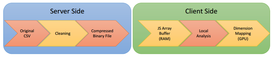
This illustration shows the processes that are on the server side and those which are loaded on the client side. On the server side, EVA loads the original CSV with all of the data and cleans up and compresses all of that data, while on the client side it loads the ArrayBuffer file in JavaScript, the local data analysis and the graphic (GPU).
To enhance the tool, Amraii and Yahyavi used a 100 gigabyte database with multidimensional data based on the LEHD (Longitudinal Employer-Household Dynamics) program dataset of the United States Census Bureau. The census bureau is an inexhaustible source of social data with millions of datasets.
No dependence on technical knowledge
One of the features that both EVA researchers point out about the tool is that it represents the complete opposite of Excel, Microsoft’s spreadsheet program which is possibly the most popular tool for data processing and analysis. According to Amraii and Yahyavi, Excel is a program that allows small data sets to be managed for a small infrastructure: PCs and slow Internet connections.
For the average user to be able to manage large volumes of data, he or she would need a supercomputer or a computer cluster for data processing and technical knowledge in programming to process it and visualize it properly. The creators of EVA believe that their tool solves both problems at once because the user has a browser and several intuitive functions. Moreover, this solution is available on-line and saves bandwidth. EVA is an accessible tool for most Internet users.
The two CREATE Lab experts drew two main conclusions from the whole EVA research process:
● High resolution: the user’s knowledge discovery largely depends on his or her ability to explore the biggest amount of data possible. More data means more knowledge.
● Exploring: by being able to explore the data from different points of view, the user is more likely to find new patterns.
EVA use cases
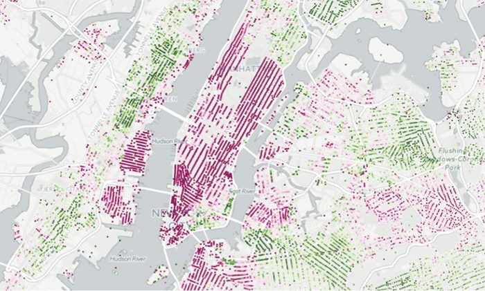
Several videos of how the tool works have been posted on the EVA channel in Vimeo. It shows how the explorer allows comparisons to be made via visualization based on maps of economic aspects such as income distribution and job creation by production or environmental sector, for example, deforestation in Sumatra over the past 12 years via the Global Forest Watch dataset, a website that tracks forests in real time.
EVA, Deforestation from CREATE Lab on Vimeo.
An example of the potential of EVA is the study into how hurricane Katrina affected employment and wealth distribution in New Orleans between 2005 and 2006. There is a practical view on its Vimeo channel.
EVA, New Orleans and Hurricane Katrina from CREATE Lab on Vimeo.
Explorable Visual Analytics is not the only case of data explorable that the CREATE Lab team have undertaken as part of their research work. They have also visualized data in other projects on fires around the world, by using maps and a time line like in EVA, inequality, air quality, the link between earthquakes and fracking in Arkansas… Indeed, EVA and other CREATE Lab projects add value when it comes to visualizing data in the field of research and the access for the average person.
Follow us on @BBVAAPIMarket